
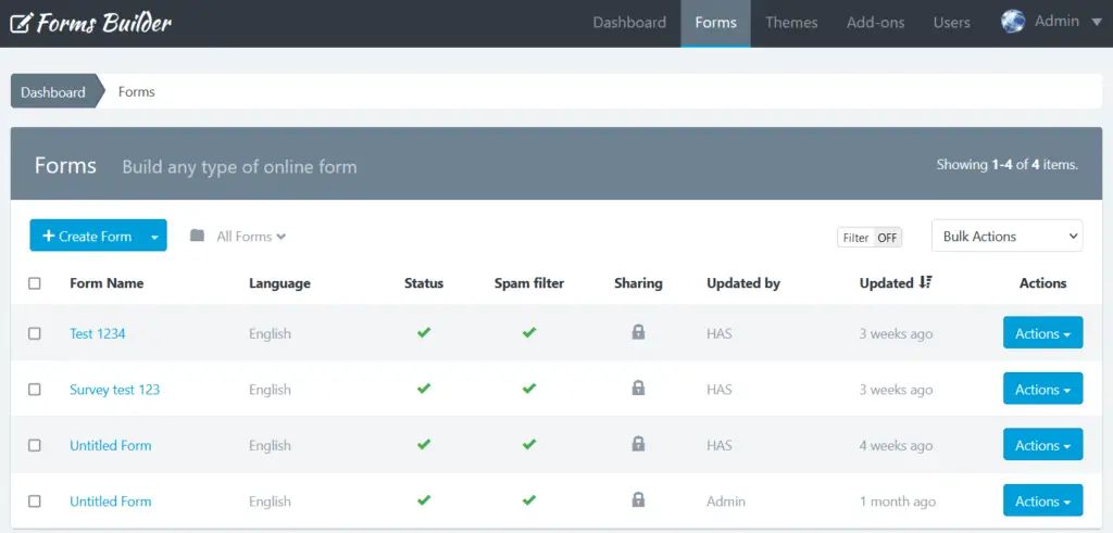
Form Manager is another important piece in Forms Builder. This is where you can see all the forms you have created in Forms Builder, all the actions that can be done to each form, like working with the users submissions, creating reports, analyzing statistics and much more.
How To Access The Forms Manager Dashboard?
Click the “Forms” menu in the navigation bar as highlighted in the picture below.
How To Create a Form?
Before you create your first form, please read The Form Creation Manual.
If you are on the Dashboard or in the Form Manager, follow these steps:
- Click “Create Form”
- Drag and drop all the fields that your form needs.
- Drag and drop one button or more, according to your needs.
- Click “Save Form”. A modal window will appear with 4 options:
- It’s Ok: Use this option if you still want to work on your form
- Let’s go to Form Settings: Use this to work on the form settings like setting up your email notification, the confirmation messages, etc.
- Share this Form: Use this if your form is ready to be shared with others as explained below in this manual.
- I finished! Take me back to the Form Manager: Use this to go back to the Forms Manager or Dashboard.
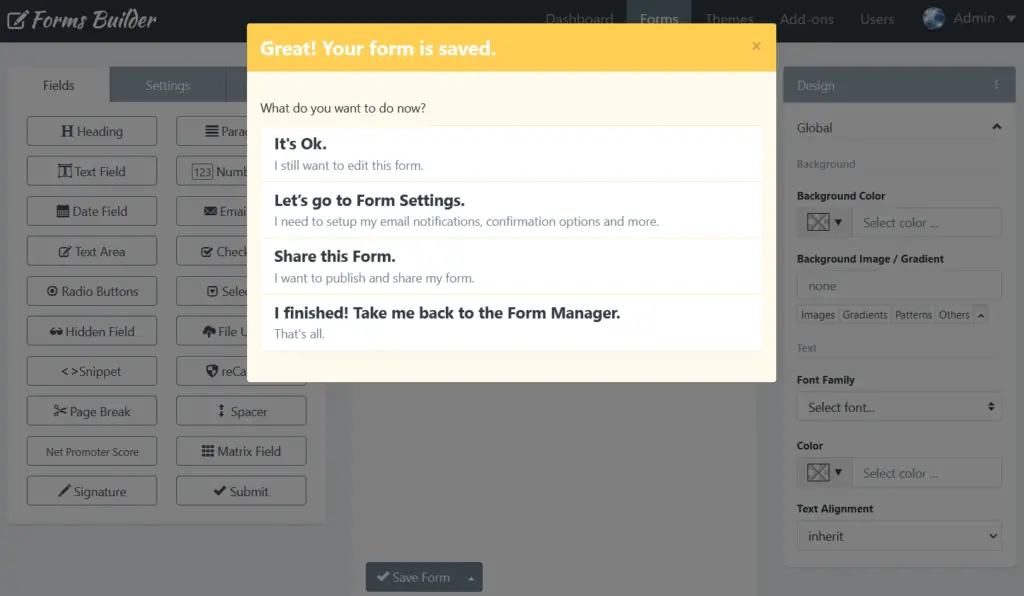
Note: If you close the modal window without choosing one of these three options, when you “Save” again, you create another form and not edit the already created. This option can be useful if you want to create several similar forms quickly.
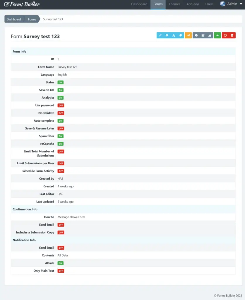
How To View Form Record?
Form record is where you get a quick overview on your form information and how it’s configured, as well as accessing other options like updating the form, settings, reports and more.
To view the Form Record, simply click on the form name from the Form Manager dashboard.
How To Update A Form?
Updating a form can be done in two ways:
- From the Form Manager Dashboard:
- Locate the form to update
- Click on the “Actions” button and select “Update”
- From the Form Record:
- To access the Form Record click the name of the form
- Then click the “Update” button (the pencil icon)
- Edit the form according to your needs.
- Click “Save Form” once finished.
Make sure to check The Form Creation Manual if you’re looking for more information on Updating Forms and understanding how to do it more effectively.
Note: You can update forms at any time, however, updating forms that are already shared with others and received submissions, may affect or corrupt the data gathered. So always make sure to back up your published forms submissions and reports before updating them.
How To Copy a Form?
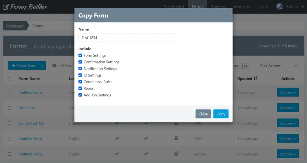
If you want to copy a form to save time, we made the process easier for you.
- To copy a form, click on the “Forms” link.
- Then, click on the “Actions” button next to the form you would like to copy.
- Then, click Copy and popup form will appear. The form name will be given by the name of your original form with “- Copy” added to it.
- You can change the name of your form
- You can select what settings should be included in the new form
- Finally, click “Copy“.
The Form Manager will display the copied form on the top of the list.
How To Import a Form?
Note: This section assumes that you have already exported your forms and saved them in a JSON file. If you have not already done so, below you can read the steps to export forms using Forms Builder.
Migrate a form with Forms Builder is a very easy process due to the simplicity of the import/export tool. Once a form is migrated, you can edit it like any other form in Forms Builder, so you won’t need to restart from scratch.
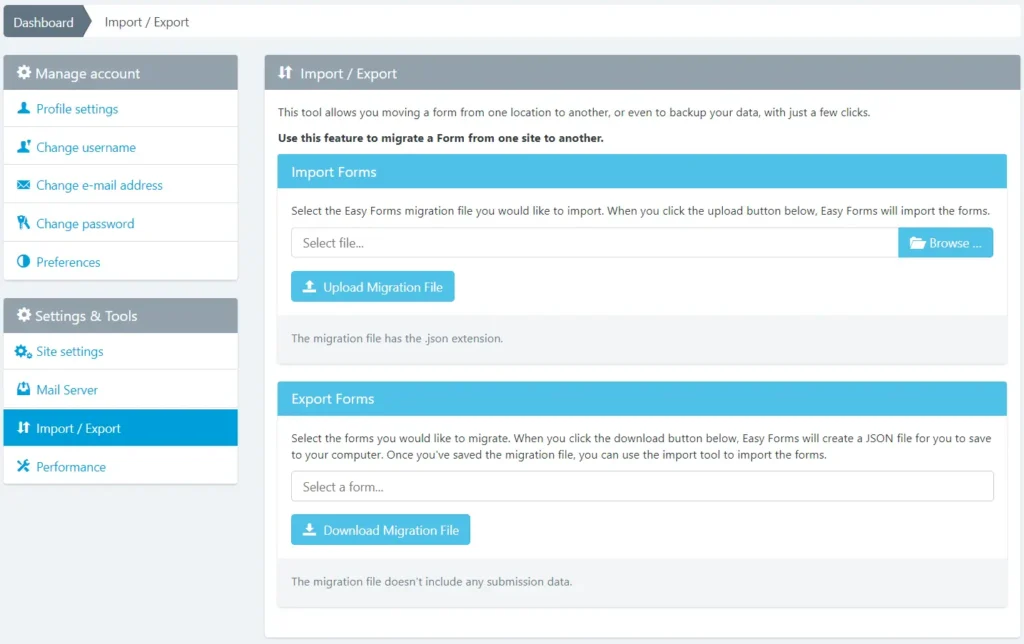
Note: You can import/export multiple forms at once.
To import a form with Forms Builder, just follow the next steps:
- Go to Forms Builder and click your username. Then, click Settings. In the Sidebar, click the “Import / Export” link.
- From here, click on the Browse button and navigate to the form settings file that you need to import.
- Click the “Upload Migration File” button.
If successful, you should see a message on the top of the page indicating that the form has been imported successfully.
You should now see the form appropriately listed with the rest of your forms
How To Export a Form?
When moving a form from one location to another, or even to backup your data, we have implemented a tool within Forms Builder to perform an export of your created forms with just a few clicks.
To export a form with Forms Builder, just follow the next steps:
- Go to Forms Builder and click your username. Then, click Settings. In the Sidebar, click the “Import / Export” link.
- In the Export Forms panel, select any forms that you want to export.
- Click the “Download Migration File” button.
- Then, you will be prompted to save a JSON file containing all of your form settings. Be sure to save this is a safe place for easy access later.
Your form should now be successfully exported. If you need to import your form, you may review the first section of this article on importing forms into Forms Builder.
Note: This export is only for Forms Builder and it does not include any submission data.
How To Reset Stats?
You can reset the form stats from the Form Manager, by clicking the “Actions” button and “Reset Stats“. Then it will show a popup asking you to confirm your decision to delete the stats.
How To Delete a Form?
You can delete a form from the Form Manager, by clicking the “Actions” button and “Delete”. Then it will show a popup asking you to confirm your decision to delete the form.
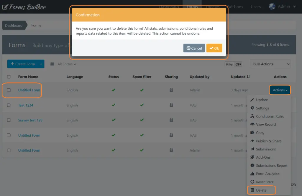
Important! When you delete a Form, all content related to it will be deleted too, including: Submissions, reports and graphs, statistics, configurations and more: This action cannot be undone.
Let’s Start
Create Your Forms
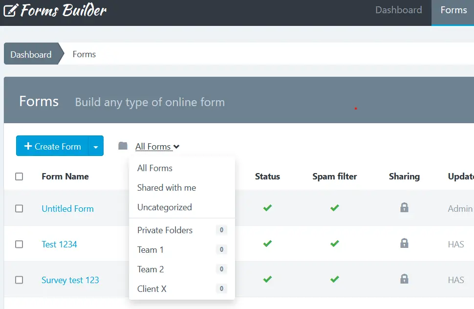
How To Use Folders To Organize Forms?
Folders help you organize and filter forms on the Forms Manager Dashboard. You can use preset folders created in the tool already or create your own folders.
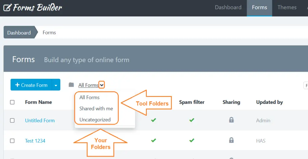
- The All Forms folder is your default folder that has everything. When you click the dropdown arrow, you get few more options:
- The Shared with me folder contains forms owned by someone else and shared with you.
- The Uncategorized folder contains the forms that have not been moved to any folder.
- Your folders: Under “Uncategorized” you’ll see a grey line with nothing below it at first because you didn’t create folders yet, but when you do, you’ll see those folders below that grey line
Create a New Folder
To create a new folder:
1- Go to the Forms page.
2- At the top of the form list, click the “Folder” icon.
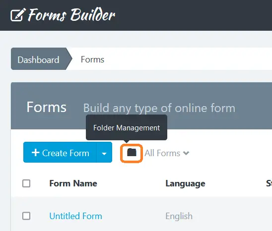
3- The “Folder Management” popup will appear.
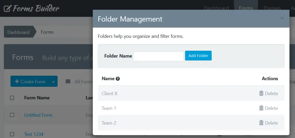
4- Enter a name for the folder.
5- Click Add Folder.
Rename a Folder
To edit the name of a folder:
- Go to the Forms page.
- At the top of the form list, click the “Folder” icon.
- The “Folder Management” popup will appear.
- Click above the folder name to edit.
- Enter a new name.
- Click Enter.
Delete a Folder
When you delete a folder, forms inside the folder aren’t deleted. Forms will stay in your account on the Forms page.
- Go to the Forms page.
- At the top of the form list, click the “Folder” icon.
- The “Folder Management” popup will appear.
- Click Delete next to the folder you want to delete.
- Click OK to confirm.
Move Forms into a Folder
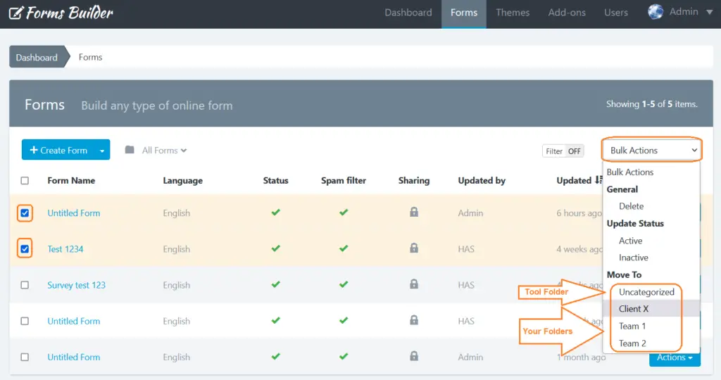
To move a form into a folder:
- Go to the Forms page.
- Select the checkbox of the form you want to move.
- Click Bulk Actions then scroll to the “Move To” section.
- Choose the folder you want to move the form to.
How To Customize Advanced Form Settings?
To access the Form Settings, you must be in the Form Manager. Then perform the following steps:
- Click on the name of the form you want to set
- Click on “Settings” (the gear icon)
In Settings, you will see 4 tabs. Each of these tabs contains the setting of a form aspect:
- Form Settings
- Confirmation Settings
- Notification Settings
- UI Settings
Let’s have a look at them one by one.
1. Form Settings
It is the first tab of the Form Settings and is displayed by default. From here you can set up:
1- Form settings section:
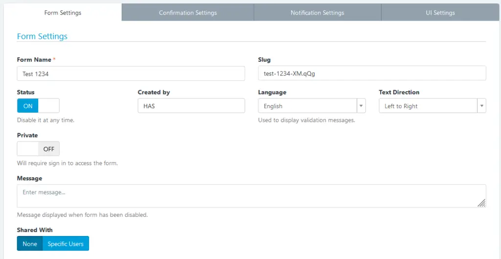
- Form Name: Displayed on the application administration pages and as the title of the form public page.
- Slug: This option allows you to customize your forms URLs. By default, slugs are created based on the name of the Form, but you can edit it here.
- Status: Indicates if the form is being shown. If set to Off, the form is no longer displayed to the user and instead appears a message indicating that the form is disabled and does not accept more submissions.
- Created by: Field available only for administrator users. Used to assign a form to a different advanced user.
- Language: This language will be used to display form messages. For example, validation errors.
- Text Direction: Allows you to set the direction in which the values appear in the form. By default, the text direction is Left to Right (LTR). But, you can change the text direction from Right to Left (RTL) from the dropdown.
- Private: Only logged-in users with the right permissions can access the Form page or Form Widget. If this option is enable, anonymous users will be redirected to the login page and users without permissions will be redirected to the Form Management page.
- Message: Sets the message to be displayed to the user when the form has been disabled (Off).
- Shared With: This feature allows you to share the form with other users. You have three options:
- None: The form will only be visible by its creator (without considering the administrator who can see all the forms).
- Specific users: Allows you to select the users who will be able to see the form.
2- Submission settings section:
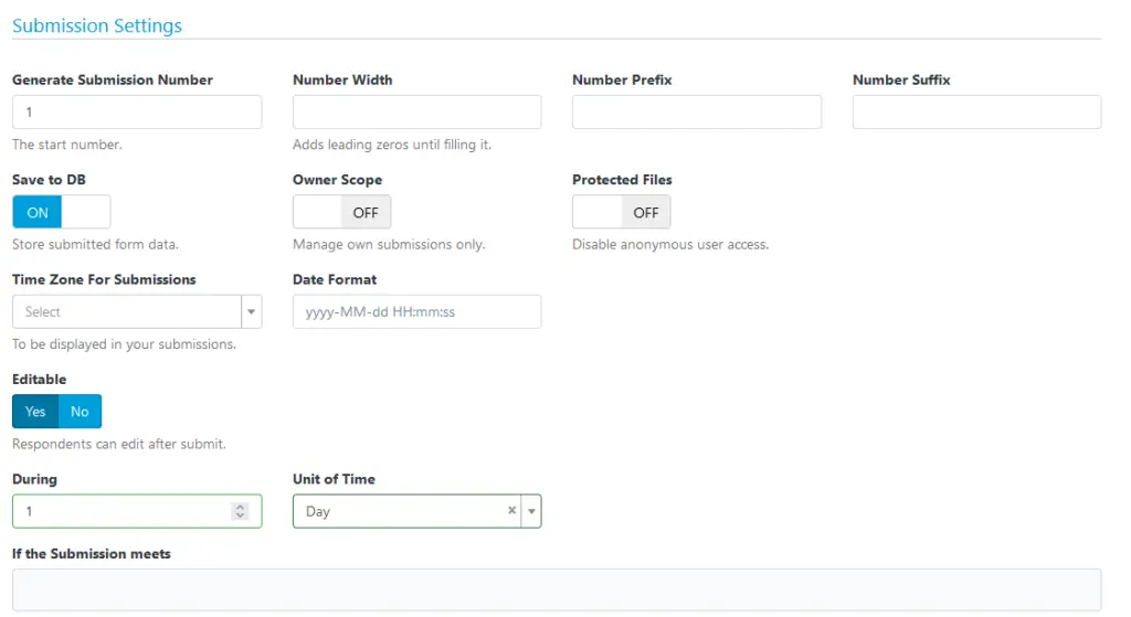
- Generate Submission Number: This option allows you to set a custom sequential submission numbering for your form. The submission number will be increased by 1 always. Except, if you set a bigger number in form settings (In this case, we are going to use this number). So, only when the number is bigger than the submission number of the previous entry we are going to use it to prevent duplicates. Take into consideration that the Submission Number helps you to identify a Submission in your Form, but a Submission ID helps you to find a Submission in the entire application. Two different forms can have the same Submission Number, but never the same Submission ID.
- Number Width: Set the minimum width of number without a prefix (zeros will be added to the left side). This will change the minimum width of the submission number for new submissions. E.g. set to 5 to have submission number displayed as 00001 instead of 1. Leave empty to disable.
- Number Prefix: Prefix before submission number (optional). This will change the prefixes for new numbers.
- Number Suffix: Suffix after submission number (optional). This will change the suffixes for new numbers.
- Save DB: Indicates if form submissions must be stored in the database or not. In any case, this does not affect each emailing entry.
- Owner Scope: When this option is active, only the Form Managers can manage all the Submissions. The rest of the users who have access to the Submission Manager, will only be able to manage their own submissions.
- Protected Files: When this option is active, only Logged-In users with Form access can access or download the files.
- Time Zone For Submissions: When this option is enabled, the submission date will use this timezone, instead the user account timezone.
- Date Format: When this option is enabled, the submission date will use this date format, instead the application date format.
- Editable: When this option is active, form submissions can be edited by anonymous users by using the Form Widget. So, you will be able to allow your users edit form entries from your own website. If you chose “YES”, new options will appear:
- During: It must be a number, for example: 1. This number defines the amount of time a user can edit a submission.
- Unit of Time: It can be Hours, Days, Weeks, Months or Years. This allows you to define exactly the time you can allow the edition. Eg. 1 hour or 1 day.
- If the Submission meets: Only Form Submissions that pass this condition can be edited. This allows us to enable/disable the edition depending on the value of form fields.
3- Form Activity and Limits Section:
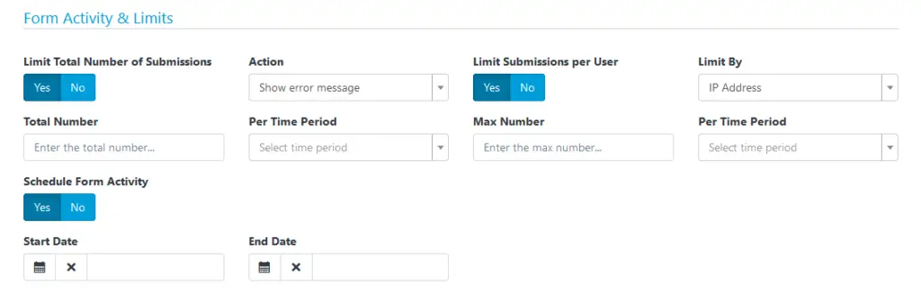
- Limit total number of submission: Specify the maximum number of submissions that the form will accept in a period. If chose “YES”, new options will pop up:
- Action: The action to be executed when a form has reached its limit. It can be: Show error message (By default) and Show error message and Disable Form (This action is only available when “Per Time Period” is “All Time“).
- Total Number: Total number of submissions to be accepted.
- Per Time Period: Period in which the number of submission will be counted.
- Limit submissions per User: Sets the maximum number of submissions that the Form can receive from the same user in a period. If chose “YES”, new options will pop up:
- Limit By: There are four options: IP Address, Browser Fingerprint, IP Address or Browser Fingerprint and IP Address and Browser Fingerprint. Use Browser Fingerprint when you disable IP Tracking or when you are running Forms Builder in an intranet and want to limit the entries.
- Max Number: Maximum number of submissions allowed.
- Per Time Period: Period in which the number of submissions will be counted.
- Schedule Form Activity: Set the start an end date in which the Form must be enabled (ON) Before and after it, the form will be automatically disabled. If chose “YES”, new options will pop up:
- Start Date: Select the date on which the form will be activated.
- End Date: Select the date on which the form will be deactivated.
4- Form Security Section:
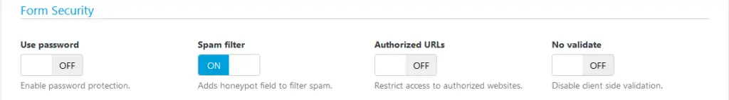
- Use password: Enable or disable the form protection by using password. If the option has been enabled, you should fill the Password field. Otherwise, the form will not be saved and instead, a validation error will be displayed. By default, this setting is OFF.
- Spam filter: Indicates if the form should use the honeypot technique to filter submissions made by real users from the ones made by bots (spam).
- Authorized URLs: To prevent a third party from embedding your Form on their own website, your form can be restricted to a list of URLs that you authorize.
- No validate: This option allows you to disable the Client-Side validation (by the browser). Take into account that the Server-Side validation won’t be disabled. It’s recommended to have this option in Off.
5- Other Options Section:
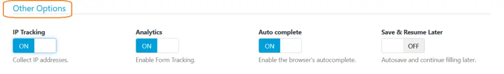
- IP Tracking: When this option has been enabled, IP addresses won’t be collected by the application. You can enable the Browser Geo-location to collect the Sender information with consent.
- Analytics: Enable/disable monitoring the form by the application. When, IP Tracking has been disabled, Form Stats will be collected with IP anonymization.
- Autocomplete: Enables the browser’s autocomplete to forms that have been previously filled. By default, this setting is ON.
- Save & Resume later: When this option has been enabled, the browser automatically will store the information entered by a user on each field to be resumed later, even if the user close the browser.
Note: There are conditionally required fields. For example, if you activate the Schedule Form Activity option, you must enter a Start and End Date. If you leave these fields in blank, you cannot save the Form Settings and instead, an error message appears.
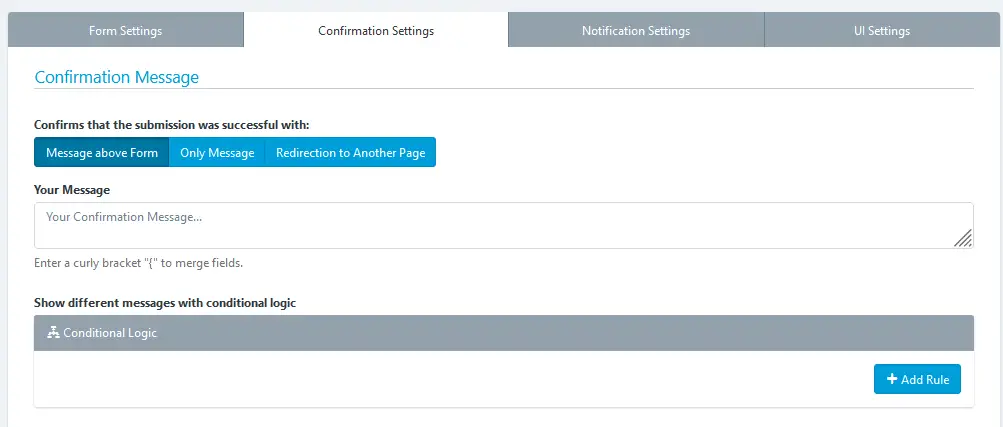
2. Confirmation Settings
This tab allows you to configure four key aspects of the submission confirmation:
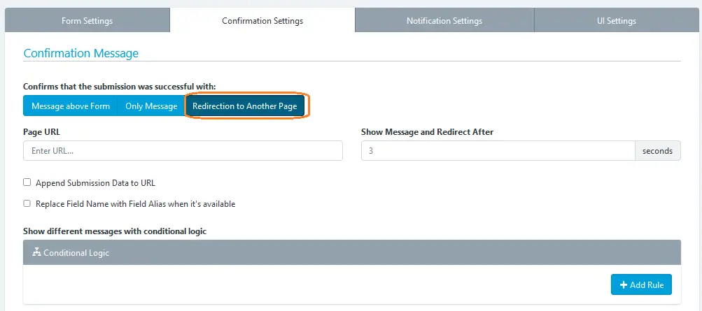
- Inform to the user immediately: Whether using a text message (alone or above the form) or redirect the user to another web page. In the first case, you must type the message to display and in the second, the full URL of the web.
- If you’d like to make the message more personal, you can insert field variables (placeholders) into a confirmation message or confirmation URL, in similar way as a confirmation message by email. Once the form has been submitted, the placeholder will be replaced with the information placed in that field.
- To Redirect the browser to another page, you can set up 3 additional parameters
- Show Message and Redirect After: Here you can enter a number of seconds to start the redirection.
- Append Submission Data to URL: This is useful for small forms when you want to append all the collected data to the URL. Eg. https://www.example.com/thanks.html?text_0=John&email_0=john@doe.com
- Replace Field Name with Field Alias when it’s available: If this option has been enabled, the collected data will be appended using the Field Alias. Eg. https://www.example.com/thanks.html?name=John&email=john@doe.com
- Conditional Logic With this tool you can customize the way that you handle and process your submissions, giving you more control once a user has submitted your form. A common example of this would be if you wanted to provide your end users the option to download a file. In this scenario you can redirect to the file to start the download process. But, if the user don’t want to get the file, we will show the Thank You message.
- Send confirmation email to the user: If you select this option, each time a user submit a form will receive an email that will thank him.
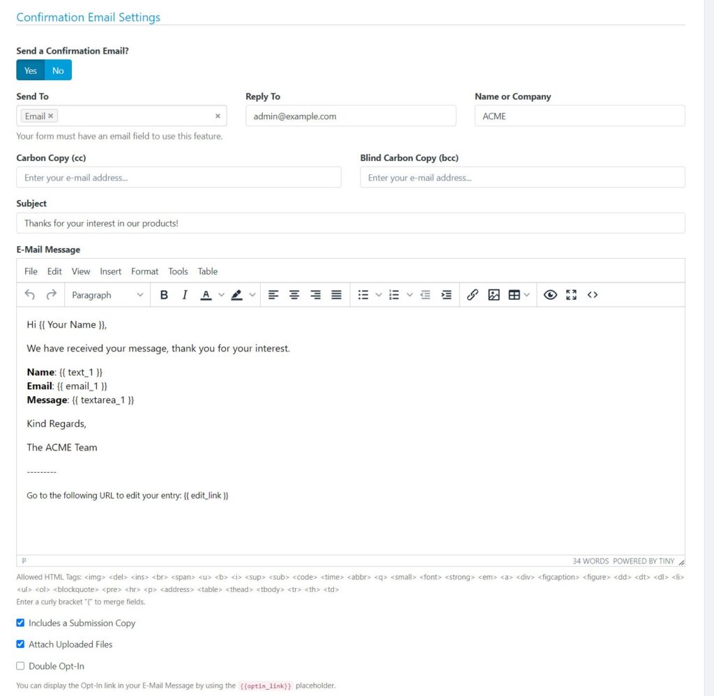
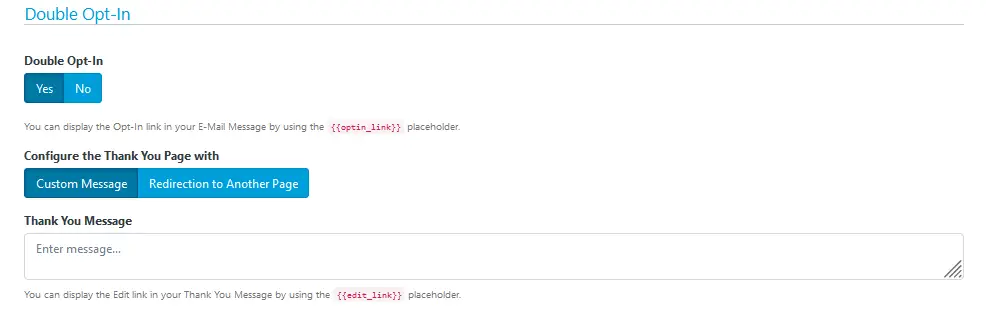
- Double Opt-In You can enable the double opt-in feature to confirm your form submission. Then you can use the placeholder:
{{optin_link}}to present the link to the Opt-In Confirmation Page. When the end-user clicks this link can be redirected to another web page or see a custom Thank You message.
Note: When the end-user confirms their Opt-In, the following event will be triggered: Email has been verified by double opt-in. This event can be used in different parts of the system, for instance to send email notifications.
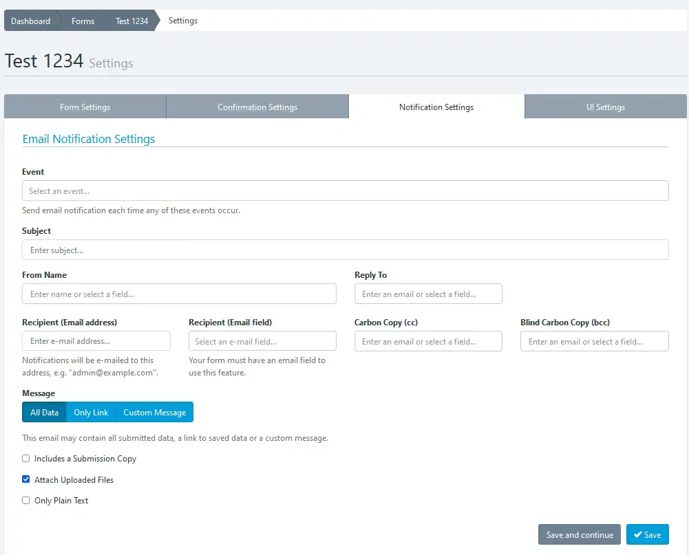
3. Notification Settings
In this tab you can configure how Form Submissions will be sent to your email (All data, only a link to the data or a custom message). Additionally, you can set the email subject, email addresses and more.
Four things to keep in mind:
- If the form has fields of “Email” type, you can select them as Send To and/or Reply To email address.
- If the form has fields of “File” type, you can attach uploaded files to emails.
- If you choose only Plain Text, a default message with all the submitted data will be sent in plain text.
- You can choose the event when the email notification will be sent:
- When the form is submitted
- When the email is verified by double opt-in
Note: You can insert placeholders (field variables) into a notification email. For more details, go to the ‘Confirmation Settings‘ documentation.
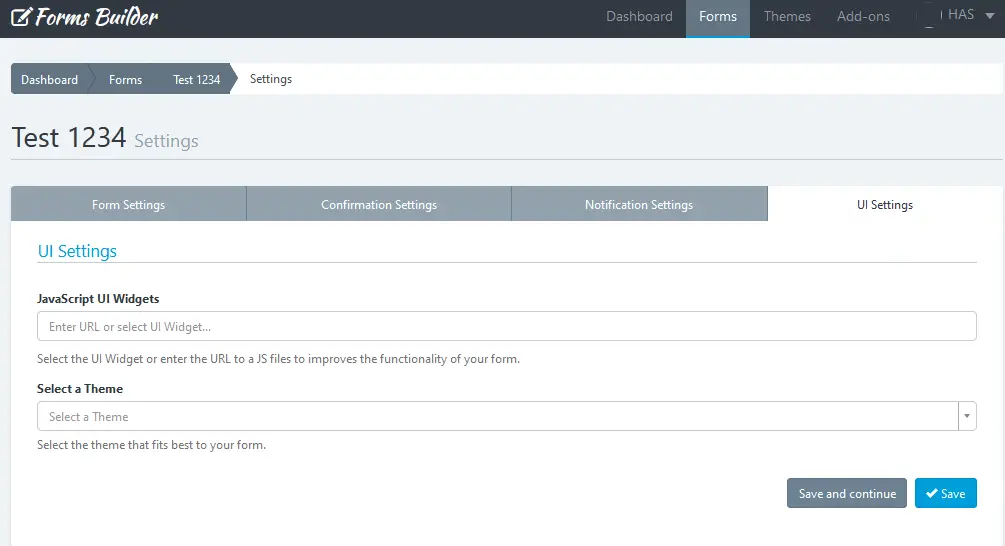
4. UI Settings
UI = User Interface.
From here you can modify the form appearance: The design by using themes, and the functionality by using an external JavaScript file.
- Load Javascript File: Enter the full URL of the JavaScript file that will be loaded with your form. By default, the jQuery library is available for you to make use of it when interacting with the form.
- Select a theme: You can select the theme that best fits your form or one you have created yourself. When you select a theme from the list, the form will be automatically displayed with the design chosen theme. You can change the themes over and over again to see differences.
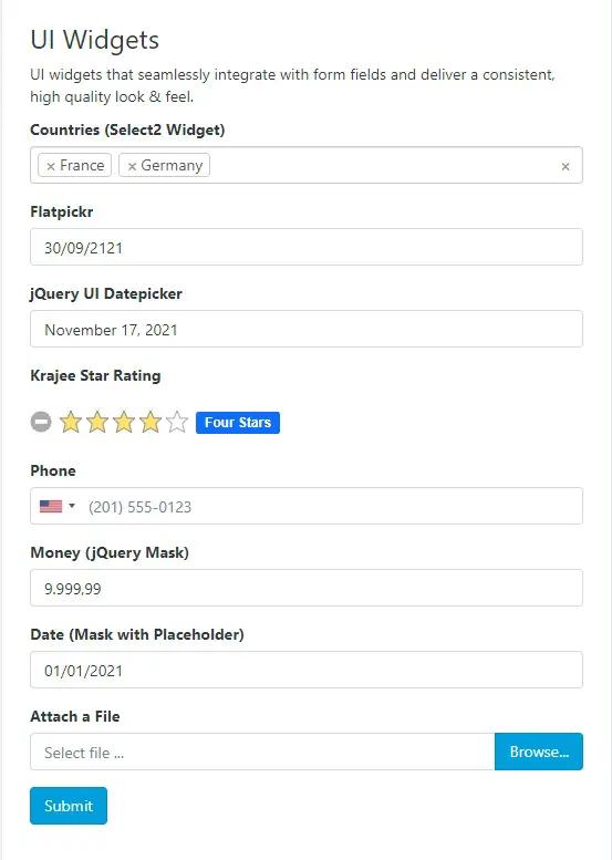
Benefit Of Using UI Widgets
UI widgets are custom controls that improve the visualization of our Standard HTML5 fields. For example, we can use the “International Telephone Input” widget to display a Dropdown with flags and country codes as dynamic placeholders. Of course, we can customize them by making use of the Form Builder’s custom attributes.
How to use a UI Widget
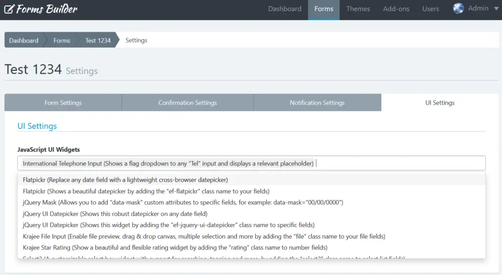
Using UI widgets is pretty easy, just go to Form Settings > UI Settings and select the UI widget you want to use in your form.
For example, we are going to select the “International Telephone Input” widget and click Save.
Let’s see the result.
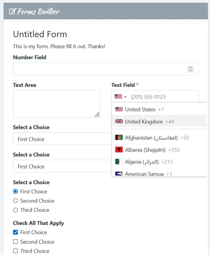
Take into account that some widgets require to add a Css Class to your Form Field. For others, like in our previous example, we only need to activate them to display them in the form.
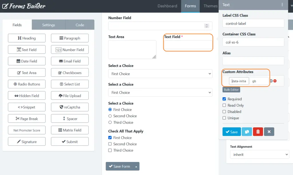
How to configure a UI Widget
To configure the UI Widget we want to use, we need to go to the Form Builder > Field Settings > Custom Attributes.
In our example, the International Telephone Inputs displays the User country flag. For this example, we are going to customize this behavior to display the flag of Great Britain. For this we are going to add the following custom attribute:
- Attribute: data-initial-country
- Value: gb
And, Save all.
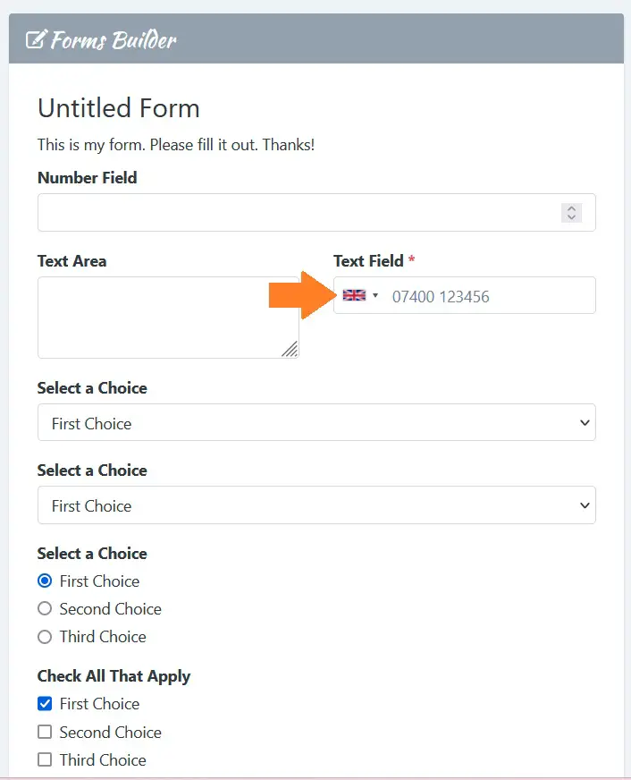
Let’s see the result.
Custom Attributes For UI Widgets
Now we are going to list all the attributes we can use to configure the UI Widgets.
Flatpickr
Replace any Date field with a lightweight cross-browser datepicker.
- data-alt-format: A string of characters which are used to define how the date will be displayed in the input box. For example: F j, Y
- data-allow-invalid-preload: Allows the preloading of an invalid date. It can be true or false.
- data-aria-date-format: Defines how the date will be formatted in the aria-label for calendar days. For example: F j, Y
- data-default-date: Sets the initial selected date in HTML5 format (yyyy-mm-dd). For example: 2021-12-31
- data-default-hour: Initial value of the hour element. For example: 12
- data-default-minute: Initial value of the minute element. For example: 0
- data-disable: A comma-separated dates in HTML5 format. For example: 2022-01-01,2022-01-02,2022-01-03
- data-disable-mobile: Set to true to always use the non-native picker. It can be true or false.
- data-enable-time: Enables time picker. It can be true or false.
- data-enable-seconds: Enables seconds in the time picker. It can be true or false.
- data-hour-increment: Adjusts the step for the hour input (incl. scrolling). For example: 1
- data-inline: Displays the calendar inline. It can be true or false.
- data-max-date: The maximum date that a user can pick to (inclusive). For example: 2021-12-31
- data-min-date: The minimum date that a user can start picking from (inclusive). For example: 2021-12-01
- data-minute-increment: Adjusts the step for the minute input (incl. scrolling). For example: 5
- data-mode: “single”, “multiple”, or “range”. Date fields are only compatible with “single” mode, but you can use the others with Text fields.
- data-next-arrow: HTML for the arrow icon, used to switch months. For example: >
- data-no-calendar: Hides the day selection in calendar. Use it along with “data-enable-time” to create a time picker. This is not compatible with a Date field, but you can use it with Text fields.
- data-position: Where the calendar is rendered relative to the input vertically and horizontally In the format of “[vertical] [horizontal]”. Vertical can be auto, above or below (required). Horizontal can be left, center or right. For example: “above” or “auto center”
- data-prev-arrow: HTML for the left arrow icon. For example: <
- data-shorthand-current-month: Show the month using the shorthand version (ie, Sep instead of September). It can be true or false.
- data-show-months: The number of months to be shown at the same time when displaying the calendar. For example: 1
- data-time-24hr: Displays time picker in 24 hour mode without AM/PM selection when enabled. It can be true or false.
- data-week-numbers: Enables display of week numbers in calendar.
- data-month-selector-type: How the month should be displayed in the header of the calendar. It can be “dropdown” or “static”. If “data-show-months” has a value greater than 1, the month is always shown as static.
International Telephone Input
Adds a flag dropdown to Phone fields and displays a relevant placeholder. The user types their national number and the plugin send the full standardized international number.
- data-initial-country: It can be “auto” or a two-letter country code, for example: “us”, “gb” or “it”.
jQuery Mask
Make masks on form fields and HTML elements.
- data-mask: To get your mask applied with the data-mask attribute just use it. For example: 00/00/0000
- data-mask-placeholder: To add a placeholder to your mask. For example: “//____”
- data-mask-reverse: Activating a reversible mask. It can be true or false.
- data-mask-clearifnotmatch: Clear field if not match. It can be true or false.
- data-mask-selectonfocus: Select Mask On Focus. It can be true or false.
Common values that you can add to the “data-mask” custom attribute:
- Date: 00/00/0000
- Time: 00:00:00
- DateTime: 00/00/0000 00:00:00
- CEP: 00000-000
- Phone: 0000-0000
- Phone with DDD: (00) 0000-0000
- US Phone: (000) 000-0000
- Mixed: AAA 000-S0S
- IP Address: 099.099.099.099
- Accept Only Numbers: 0#
jQuery Ui Datepicker
Select a date from a popup or inline calendar on any ‘date’ field.
- data-date-format: The format for parsed and displayed dates. For example: mm/dd/yy
- data-show-button-panel: Whether to display a button pane underneath the calendar. It can be true or false.
- data-change-month: Whether the month should be rendered as a dropdown instead of text. It can be true or false.
- data-change-year: Whether the year should be rendered as a dropdown instead of text. It can be true or false.
- data-year-range: The range of years displayed in the year drop-down. For example: 2019:2022
- data-number-of-months: The number of months to show at once. For example: 1
- data-min-date: The minimum selectable date. For example, “+1m +7d” represents one month and seven days from today
- data-max-date: The maximum selectable date. For example, “+1m +7d” represents one month and seven days from today.
- data-is-rtl: Whether the current language is drawn from right to left. It can be true or false.
- data-show-week: When true, a column is added to show the week of the year. It can be true or false.
- data-first-day: Set the first day of the week: Sunday is 0, Monday is 1, etc.
Krajee File Input
Add the “file” css class to the file field to enhance the HTML 5 file input.
- data-browse-label: The label to display for the file picker/browse button. Defaults to Browse…
- data-browse-icon: The icon to display before the label for the file picker/browse button. Defaults to
- data-remove-label: The label to display for the file remove button. Defaults to Remove.
- data-remove-icon: The icon to display before the label for the file remove button. Defaults to .
- data-cancel-label: The label to display for the file upload cancel button. Defaults to Cancel.
- data-cancel-icon: The icon to display before the label for the file upload cancel button. Defaults to .
- data-upload-label: The label to display for the file upload button. Defaults to Upload.
- data-upload-icon: The icon to display before the label for the file upload button. Defaults to .
- data-show-preview: Whether to display the file preview. It can be true or false. Defaults to true.
- data-show-browse: Whether to display the file browse button. It can be true or false. Defaults to true.
- data-show-remove: Whether to display the file remove/clear button. It can be true or false. Defaults to true.
- data-show-upload: Whether to display the file upload button. It can be true or false. Defaults to true.
Krajee Star Rating
Display a Star Rating widget on any field with the .rating css class. Also, we can use a custom theme with the following css classes:
- .rating-theme-fas: Font Awesome 5.x Theme
- .rating-theme-uni: Unicode Theme
- .rating-theme-gly: Glyphicons Theme
We can customize this widget by using the following custom attributes:
- data-container-class: The CSS class to be appended to the star rating container. This is useful if you want to prefix some CSS class to the container and override the plugin widget styling for your use case.
- data-empty-star: The symbol markup to display for an empty star. Defaults to:
- data-filled-star: The symbol markup to display for a filled / highlighted star:
- data-stars: The number of stars to display. Defaults to 5.
- data-min: The minimum value for the rating input. Defaults to 0.
- data-max: The maximum value for the rating input. Defaults to 5.
- data-step: The step to increment the rating when each star is clicked. Defaults to 0.5.
- data-rtl: Whether the rating input is to be oriented RIGHT TO LEFT. It can be true or false. Defaults to false.
- data-show-caption: Whether the rating caption is to be displayed. It can be true or false. Defaults to true.
- data-size: Size of the rating control. One of xl, lg, md, sm, or xs. Defaults to md.
- data-default-caption: The default caption text, which will be displayed when no caption is set up for the rating. Defaults to {rating} Stars.
- data-star-caption: The caption text corresponding to one star. Defaults to One star.
- data-star-captions: The caption text corresponding to multiple star. Defaults to {rating} stars.
- data-clear-button: The markup for displaying the clear button. Defaults to
- data-clear-button-title: The title displayed on clear button hover. Defaults to Clear.
- data-clear-caption: The caption displayed when clear button is clicked. Defaults to Not Rated.
Select2
Display a Select2 widget on a Select List field with the .select2 css class.
We can customize this widget by using the following custom attributes:
- data-theme: The theme to be used by the widget. It can be classic or bootstrap. Defaults to bootstrap.
- data-placeholder: The placeholder to be displayed when no option is selected. For example: “Select a country“.
- data-allow-clear: Allows the user to clear the current selection. It should be used with “data-placeholder” to work. It can be true or false.
- data-tags: Allows the user to create new options from text input by the user in the search box. It can be true or false.
- data-maximum-selection-length: For example: 2
- data-minimum-input-length: Only start searching when the user has input a number of characters. For example: 3
- data-maximum-input-length: Allows you to limit the length of the search term such that it does not exceed a certain length. For example: 20
- data-minimum-results-for-search: Allows you to hide the search box depending on the number of results. For example: 3.
Note: To save all the changes you make on any tab, click the “Save” button.
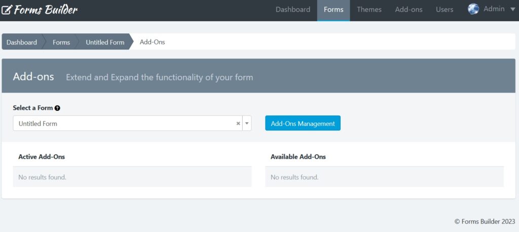
How To Enable Add-Ons?
You can use add-ons to do more with your Forms provided you have access to these add-ons. If a user has permission to access the add-ons, the option “Add-Ons” will appear in the Form Manager (Forms > Actions > Add-Ons), from here you can manage the add-ons configuration that are active and are available for each form.
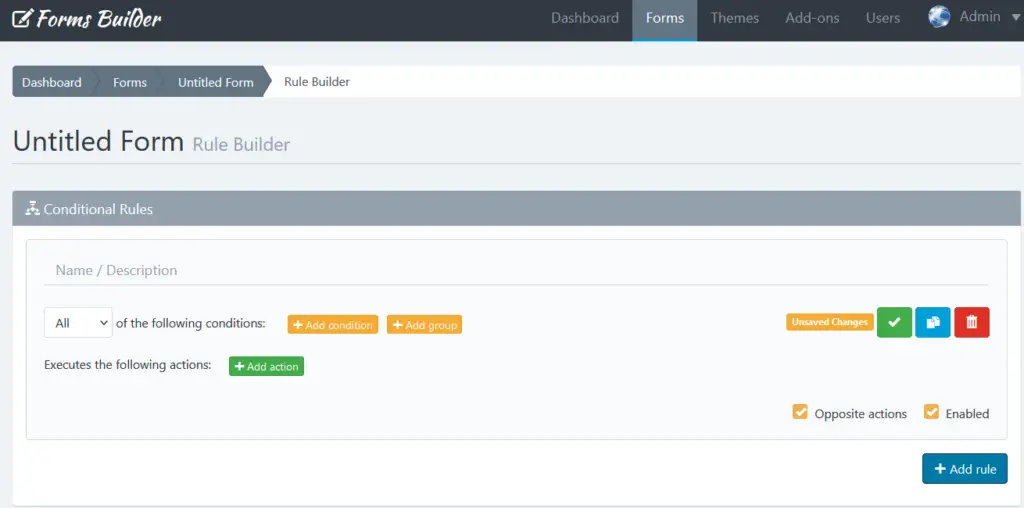
How To Add Conditional Logic To a Form?
Forms Builder features a powerful and intuitive tool to add conditional logic to a form.
The rules are based on the information that the form fields have at any given time and allow you to disable or enable and show or hide fields and other elements in the DOM. In addition, you can also do math and skip pages with this powerful tool.
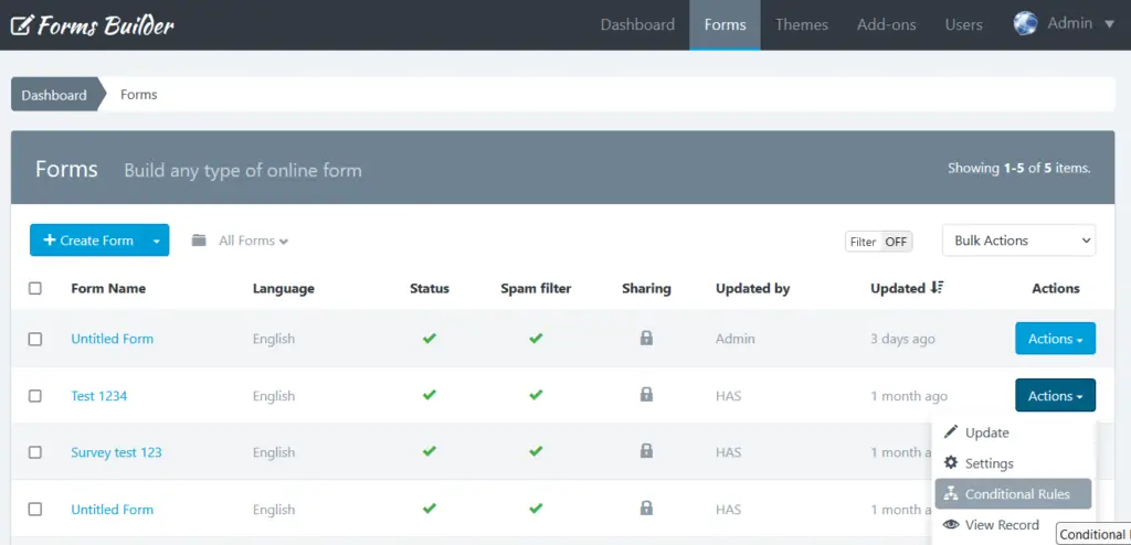
You can access the Rule Builder from the Form Manager:
- In the navigation bar, click “Forms”
- Click on “Actions” for the form you want to set a rule for then choose “Conditional Rules” OR
- Click on the form itself, then click on the button “Conditional Rules” (Flow Graph icon) from the menu above
- Click Add Rule
- Build the role you want
- Click “Save” (the green check mark icon) once finished adding the rule
- Add another rule if you want then save it as well
- Repeat till you’re done with adding rules.
Note: If you have questions about your first conditional rule, please read the Rule Builder documentation.
How To Publish and Share a Form?
You can access to publish and share a form using the Form Manager:
- In the navigation bar, click “Forms”
- Click on the form name you want to share
- Click on the “Publish and Share” button (the green arrow icon)
- Next you’ll be presented with different options to choose from as explained below.
1- Embed Full Form
This allows you to get the code to be placed on the website which will display the form (inline or in a modal pop-up).
The forms can be published in two formats: With or Without design (no theme) and can be shared in different ways, depending on the configuration you assigned. For example, you can share the Form in complete page and without the application logo.
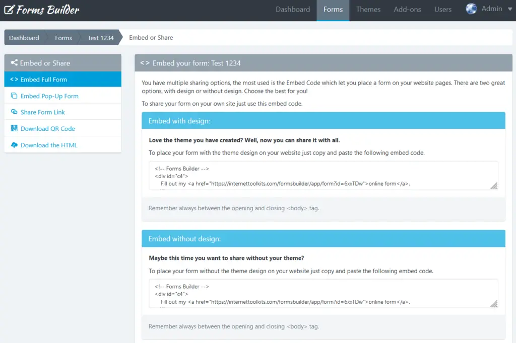
Embed code are a few lines of html and javascript that you can use to embed an Easy Forms’ form into your own website. This is the easiest way to display a form on your site and the method least susceptible to errors. Also, one of the most important things about the form widget is that every time you make a change to your form in the form builder, the embedded form will automatically update.
The Form Widget has been designed to work on any web page. Our Form Widget basically creates an iFrame on the fly, and the form will be loaded in it. Then, since it creates the iFrame, it can also resize it and that means there’s no need to update the code every time you make some change. Also, when you keep a form inside an iFrame, you also prevent it from conflicting with existing JavaScript or CSS elements on your page.
Which Form Embed Code Should I Use?
Right now Easy Forms offers two options for publishing a form in your web site:
- Embed with Design: Lets you publish the form with the theme that has been applied to the form.
- Embed without design: Lets you publish the form without any theme, even if you have applied one to your form.
Usually, the first option is the one you should use.
How to populate a Field with a Querystring?
You can populate a field with URL parameters. Just make sure to use the Field ID or Field Alias as the parameter key, then the value assigned to this parameter will appear in the field.
Note: If you are using a Multi-Step Form, you can go to a specific page by appending the page number to the URL, for example to go to the second page add the “p=2” query string.
How to listen postMessages sent by the Form Widget
To be able to listen to the messages sent by the Form Widget, you simply have to add an event listener to your web page. For example, if you need to know a submission ID from your own webpage, you can add this code bellow the pasted embed code:
window.addEventListener("message", receiveMessage, false);

function receiveMessage(event) {
    if (event.data) {
        var data = JSON.parse(event.data);
        if (typeof data.action !== "undefined" && data.action === "success") {
            console.log("Submission saved with ID", data.data.id);
        }
    }
}
Form Widget Setting
The Form Widget (embed code) has two parts:
- An HTML code that displays the default content if the user accesses the form when JavaScript is disabled in his browser. By default, a link to your form within a DIV element is displayed.
- A Javascript code that is responsible for displaying the form and initialize the Form Tracker (if Analytics is enabled).
The form widget allows you to set some options of the form on the fly:
- Id: Form’s ID in the application. For example:
'id': 132 - Sid: Submission ID. Use this option to edit a form submission previously collected. To find the Submission ID, go to the Submission Manager. For example:
'sid': 964 - Container: ID of the HTML element where the form’s iframe will be inserted. By default, points to the DIV ID that contains the link to the form. For example:
'container': 'c132' - Width: Specifies the width of the form’s iframe. For example:
'width': '100%' - Height: Specifies the height of the form’s iframe. Usually, the embed code comes set with a value in pixels. This value is calculated by the Form Builder at the time of its creation. For example:
'height': '846px' - Auto Resize: By default, is enabled. Indicates whether the iframe can automatically resize to the real height of the form. For example, when validation messages are shown. If set to false, the form does not resize and its height will be defined in the “height” option. For example:
'autoResize': !0 - Theme: By default, is enabled. Is a integer value (1 or 0) that lets you enable or disable a theme on the fly. For example:
'theme': 1 - Custom JS: By default, is enabled. Is a integer value (1 or 0) that lets you enable or disable the loading of external javascript files on the fly. For example:
'customJS': 1 - Record: By default, is enabled. Is a integer value (1 or 0) that lets you enable or disable the Form Tracker on the fly. For example:
'record': 1 - Reset: By default, is enabled. Is an integer value (1 or 0) that lets you enable or disable the form reset when form is submitted. For example:
'reset': 0 - Page: In a Multi-Step Form, this option specifies the page we want to display by default. For example, to display the second page:
'page': 2 - Form: Specifies the path to the form’s embed. It contains no parameters.
- addToOffsetTop: By default, is 0. Add or subtract a number of pixels to OffsetTop before calculating the form location. This allows correct the form location when html elements on the website (like a header) have the CSS property: “fixed”. For example:
'addToOffsetTop': '-60' - Default Values: If you want to pre-fill form fields with default values, you can use this option. Default Values is a JSON object where your key is the id of the form field and its value is the content of the field. For example:
'defaultValues': {
    'text_0': 'This is my default value'
}
Note that checkboxes and radio buttons will be selected with boolean values. For example:
'defaultValues': {
    'text_0': 'This is my default value',
    'checkbox_0': true
}
Interacting with the Form via JavaScript
The Form Widget contains many features and options that can be configured inside an external JavaScript File.
Note: To load a JavaScript File you must go to Forms -> Actions -> Settings -> UI Settings.
By default, a jQuery object is available. So you can interact with the Form in a very simple way by using the following lines of code:
$( document ).ready(function() {
  // Here we can interact with the Form
});
The Form element
The Form element – formEl – is a jQuery object to which you can access for get information and/or manipulate it directly. For example, we’re going to know the hight of our form with the following lines of code:
$( document ).ready(function() {
  console.log('The form height is', formEl.height());
});
Listening for Events
Certain events are triggered when the Form does something.
- view: This event will be triggered when a form has been viewed.
- fill: This event will be triggered the first time you interact with the form. For example, by fill a text field or select a radio button.
- error: This event will be triggered when the Server threw a validation error.
- success: This event will be triggered when the Form has been submitted successfully.
- nextStep: This event will be triggered each time you progress to the next step in a multi-step form.
- previousStep: This event will be triggered each time you go back one step in a multi-step form.
A very basic example for detecting when a form fail would be:
$( document ).ready(function() {
    formEl.on('error', function(event) {
        /* Track a server validation error
 */
        /* What happens here would be dependent on your analytics product! */
    });
});
The Rule Engine also triggers the following events when a field is shown or hidden by using conditional rules:
To implement this feature, the rule engine will trigger the following events:
- ef.shown: This event will be triggered when a field has been shown.
- ef.hidden: This event will be triggered when a field has been hidden.
Then, to interact with these events just write the event listeners. For example:
$( document ).ready(function() {
  $('#text_1').on('ef.shown', function(e) {
    console.log("This text field has been shown.")
  });
  $('#text_1').on('ef.hidden', function(e) {
    console.log("This text field has been hidden.")
  });
});
The Event Handlers: previousStep and nextStep
In addition to the events, Easy Forms offers two event handlers that allow you to go backward and forward a page on a Multi-Step form ready to use using JavaScript. For example, now we’re going to see how to forward a page without pressing the button “Next” using the auto-advance feature.
Auto-Advance in Multi-Step Forms
By default, when you create a Multi-Step Form, two navigation buttons are added automatically: “Previous” and “Next” at the bottom of the form. These buttons allow you to navigate through the form until you reach the last page where usually the Submit button is placed.
Note: Easy Forms lets you add multiple Submit buttons on different pages or parts of the form.
However, in certain use cases you can may want to advance directly to the next page without pressing any buttons. For this we will make use of the “nextStep” event handler.
Note: Some use cases in which this feature is useful are surveys and/or tests where is not allowed to change response and lets to complete the survey as soon as possible.
For example, with the following lines of code, we are going to tell our Form that each time a radio button is selected, the form will forward to the next page:
$( document ).ready(function() {
    $('input[type=radio]').on('change', nextStep);
});
Finally, if you want to hide the navigation buttons you can add the following lines in the CSS Theme assigned to your form:
.previous, .next {
    display: none !important;
}
Upload Multiple JavaScript and CSS files in our Form
By having the jQuery object, we can make use of jQuery.when().done() to load multiple javascript objects and make use of them once they are ready to use. Let’s see the following example.
Display a jQuery UI DatePicker in a Date field
For example, with the following lines of code we will show a jQuery UI DatePicker in the Date fields of the form:
$( document ).ready(function() {
    $.when(
        $('head').append('<link rel="stylesheet" href="https://code.jquery.com/ui/1.11.4/themes/smoothness/jquery-ui.css" type="text/css" />'),
        $.getScript( "//cdnjs.cloudflare.com/ajax/libs/jqueryui/1.11.4/jquery-ui.min.js" ),
        $.Deferred(function( deferred ){
            $( deferred.resolve );
        })
    ).done(function(){
        $('body').css('padding-bottom', '200px'); // Padding for show the datepicker
        $('input[type=date]').each(function () {
            $(this).attr('type', 'text').after(
                $(this).clone().attr('id', this.id + '_alt').attr('name', this.id + '_alt')
                    .datepicker({
                        // Consistent format with the HTML5 picker
                        dateFormat: 'mm/dd/yy',
                        changeMonth: true,
                        changeYear: true,
                        altField: this,
                        altFormat: "yy-mm-dd"
                    })
            )
            .hide();
        });
    });
});
As you can see:
- We’re loading 2 files within the function when(): jquery-ui.css and jquery-ui.min.js.
- We have inserted a function that will run when the previous two files are loaded on the page within the function done().
- The function basically runs 3 Instructions:
- Find all fields of type “date” and convert each field “date” in “text“.
- Clone each Date field in a Text field that displays the DatePicker.
- Hides the Date field, because its value will be established automatically by the DatePicker, by the attributes: altField and altFormat.
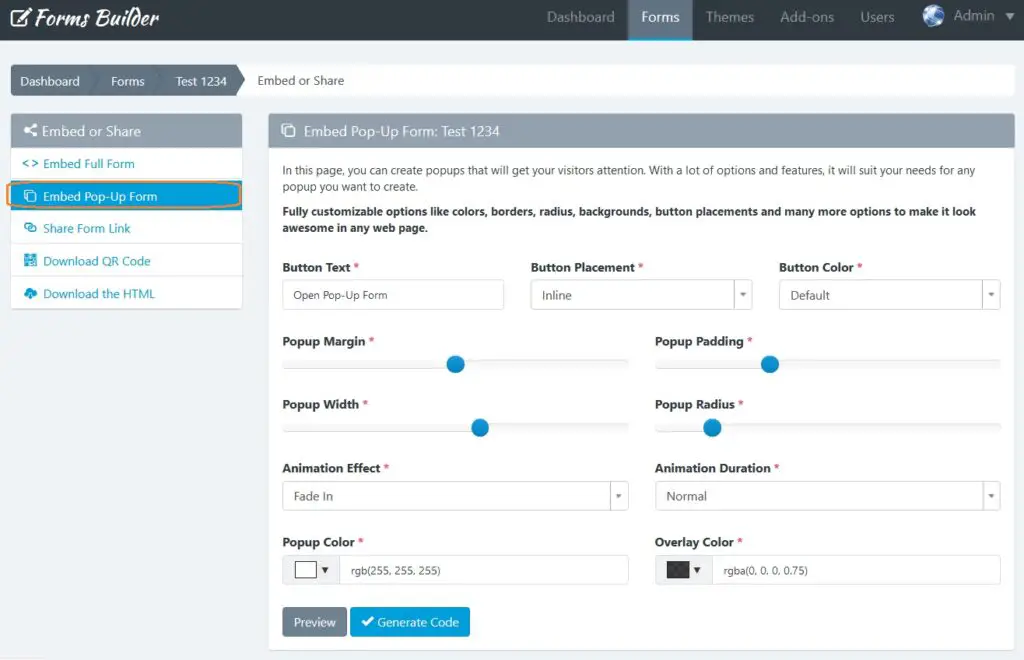
2- Pop-Up Designer: Place the form inside a popup
You can place the form inside a popup and design the look and feel of this popup without writing a single line of code.
To use the Pop-Up Designer, follow the next steps:
- In the navigation bar, click “Forms”
- Click on the form name you want to share
- Click on the “Publish and Share” button (the green arrow icon)
- Click on the “Embed Pop-Up Form” menu.
In this page you can create popups that will get your visitors attention.
You can customize a lot of options like colors, borders, radius, backgrounds, button placements and many more.
To finish, click on the “Generate code” button to open a modal and copy the HTML code that you must insert in your web page.
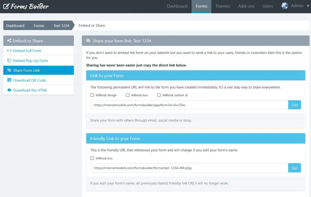
3- Share Form Link
You can also copy the form permanent link and share it via email or social networks. You can also share links with friendly URLs to your forms, immediately!
Note: Keep in mind that if you are going to share your form with a friendly URL, you must also update your theme background-image (if using one).
4- Download QR Code
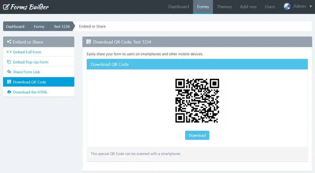
QR Codes are an excellent way to connect people from print media or invite people in a mobile world to complete your form.
To download the QR code, follow the next steps:
- In the navigation bar, click “Forms”
- Click on the form name you want to share
- Click on the “Publish and Share” button (the green arrow icon)
- Click on the “Download QR Code” menu.
In this page you can see the QR Code to the friendly link of your Form. Also, you can click the “Download” button to share it with your users.
5- Download the HTML
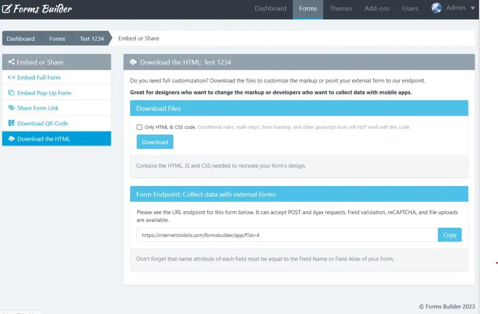
Forms Builder has the ability to generate endpoints, then you can use them to make fully customizable forms.
You can download the HTML code of your Form to integrate it directly on your webpage or mobile app, and use the form’s backend endpoint to collect data.
Download the HTML
To download the HTML code, follow the next steps:
- In the navigation bar, click “Forms”
- Click on the form name you want to share
- Click on the “Publish and Share” button (the green arrow icon)
- Click on the “Download the HTML” menu.
In this page you can see the button to download the HTML code as a Zip file. Also, you can copy the Form Endpoint directly.
Note: If you want to replace the “name” attribute of each field, you need to set it as a Field Alias in the Form Builder.
Form Endpoints
To collect data with the Form Endpoint just copy the URL and change your landing page’s form ACTION url or point a Webhook to this URL. Just take into account two things:
- The field alias of each field should be equal to the field name of your form.
- If your POST request has an associative array format, you can use a Dot Notation. For example, Elementor Forms sends webhooks as associative arrays with this format:
[
  'fields' => [
    'name' => [
      ´value´ => 'John'
    ]
  ]
]
So, instead of using the alias: ‘name’, we need to use the dot notation. For this example, to capture “John” we need to use the following alias: fields.name.value.
Other Forms Builder Manuals
- Forms Builder: Create Forms Easily (Landing Page)
- Forms Builder: Account Manager Manual
- Forms Builder: Form Creation Manual
- Forms Builder: Creating Rules Manual
- Forms Builder: Themes Designer Manual
- Forms Builder: Add-Ons Manager Manual
- Forms Builder: Templates Manual
- Forms Builder: Submission Manager Manual
- Forms Builder: In-App Analytics Manual
- Forms Builder: Report Builder Manual